Purely Old-School

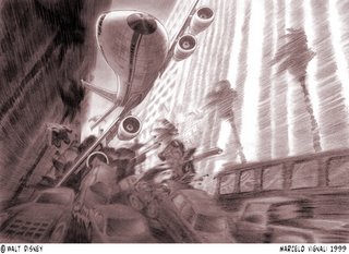
No, this isn’t a drawing of 9/11, but rather this was drawn two years earlier for Lilo & Stitch.
When I was working on Lilo & Stitch in 1999, there was a scene where Stitch hijacks a 747 while attempting to escape capture. This ensues a chase scene that takes the jumbo jet throughout Honolulu; in this scene Stitch takes the airliner into the heart of Honolulu.
I was working from Utah at the time as a freelancer, but from what I heard, the entire scene was animated and colored when 9/11 hit. At which point the company knew they could never release the movie with that scene…so it was pulled and redone. The chase scene that ended up in the final version of the movie was the alien spaceship being chased through the Hawaiian mountains.
This was drawn with Prismacolor pencil and vellum. There was no Photoshop or other computer program used to create this effect. It was done purely old-school.
 No, this isn’t a drawing of 9/11, but rather this was drawn two years earlier for Lilo & Stitch.
36 comments :
Amazing how you suggest so much speed in the drawing!
Man it would have been great to see that scene. Why didn't they put it on the dvd extras? oh well.
Love the shot design!
Really great illustration! I love it!
I remember hearing all about that scene but until now I've never actually seen any art from it. There's no special edition dvd out yet for Lilo & Stitch so hopefully it can make it on there.
But again that is a really great drawing!
Yet again, awesome Marcelo.
Beautifully done Marcelo!
Thanks for that sneak peek.
Nice to see something done without any computer inhancement and still look extremely cool. you can sense the movement-great work and sad to see this wasn't used.
I love old school.
Beautiful Marcelo. You are a wonderful draftsman with a nice unique touch. Great scene, I am sure they will release this sequece in time.
Impressive work as always.
MAC
Wow, the effect works REALLY nicely. And a great drawing, as always :)
Very nice! And definitely 'of the time' considering when 9/11 happened.
Do you have a sequential version of this sequence? There's so much movement in this on panel, but it does look like a 'setup'. It's a bit more finished than a straight storyboard. Did you take every board panel to this level of rendering?
We'll add your link to ours. Beautiful work!
Truly awesome work.
Thanks for sharing the knowledge too.
Cheers to you,
Milenko
Thanks everyone!
Doodlers, to answer your question, I'm a visual development artist. That means I'm the guy that is at the front end of the film creating images that inspire the look, style or locations...in some cases before the story artists begin working on a scene. And, in some cases still, before the script. (That happened on Atlantis.)
As the project progresses, and the story artists begin to develop the linear story and these visual development drawings have to be altered to work with the story. Typically, visual development work seldom makes it to the screen untouched, rather it has many translations before it hits the final screen.
You will note that most of my work is only remotely similar to the final films. That's the difference between production work, and preproduction work...which is what I do.
Actually, there were several views that I did for this scene. From the start of the chase, to its finalle. In total I would say there were about ten.
Thanks for the question.
damn.
>oVi
Hey Marcelo,
I remember hearing about that sequence, which of course was a bit unfortunate. This one is really amazing. The speed effect is so realistic and action packed it almost looks like the plane is actually moving on the paper! The slight distortion of the BG works really well too. I like studying your drawings, cause it makes it easier for me to understand what to look for in photos.
Take care,
Hans
This is incredible.
Hola Marcelo,
Great illustration!
Hugs for all
WOW! ... that's the original ending of Lilo and Stitch!! Great to see the artworks of it!! Beautiful!
thats amazing, very dynamic and....just amazing. please dont mind im adding you to my links.
wonderful image!
Thanks for posting this.My wife was working in rough inbetween on a scene in this sequence as she watched the 1st plane hit the tower on tv that tragic morning.I was c.u. on a Nani scene at the same time. I will never forget the emotions of that sad day.
Hey Marcelo,
Love your work. I found your blog through David Colman's blog. Another great artist.
I was wondering what one needs to do/study to get into pre-production or become a visual development artist?
I might know the answer, but i thought i'd ask you to see if i'm right ;)
Thanks,
George
To borrow a quote: "There's no school like old school!" Beautiful as ever! Love the dynamic angle & the blur is amazing.
Thanks again everyone. I've been on vacation so I haven't been posting lately. But, I'll see if I can post something this coming week.
George, to do vis dev, you need to be a solid talent. You have to bring a lot of things to the table, so you have to study a lot of different disciplines: perspective, composition, anatomy, design, construction...and innovation. You have to study a lot to be good at all these disciplines, and you have to be able to vary your styles.
Then, you need to gain the respect of your peers, at which point you'll be brought onto projects in development to assist in their creation.
Hey Marcelo,
Thanks for the reply. It sounds easy enough. *Gulp.
Hehe.
Looking forward to seeing more of your work and getting inspired to work hard on those viz dev disciplines.
Thanks again,
George
You have truly mastered the pencil, this pic is insane
Marcelo---Man...amazing....really beautiful work.:)
so much energy! Old school indeed. Also, The figure drawings you posted...capture so much in such a short period of time. wonderful
Your "old skool" is more new than I can ever hope to achieve! Wow!
For those of you interested, go to Armand Serrano's blog site, listed in my "blog links" section, and see his version of the same sequence.
silly question coming.
Is a visual dev artist the same as a concept artist?
My friend and i are having a discussion about whether or not they're basically the same thing.
Thanks.
-George
George,
Yes, the two are relatively the same. A visual development artist can be a concept artist, but a concept artist isn't always a visual development artist.
A vis dev artist is typically an animation concept artist. This means that they have to not only conceptualize...but also stylize. Whereas a concept artist isn't always hired to stylize (come up with a style).
A concept artist can deal with broad ideas, but may leave the stylization for someone else. For example, lets say you are developing a computer game. You hire someone to develop the game-play, characters and overall theme, but you contract another artist to tie it all together with a consistant visual style.
Tim is an expert gamer with lots of experience, but Mike has a great comic book style. You hire Tim as your concept artist, and Mike as your visual development.
In many cases, the two jobs are one and the same. In my case...I do both. (However, I must admit that conceptual work is very rewarding and personally more satisfying.)
this is amazing... lost for words!
all your layouts are amazing... I especially love the widescreen western one. I spent 20 mins looking at it..jeeez.
Ciao Marcello!!! Yes, great work, so dynamic and refreshing, awesome composition and atmosphere, and at the same time everything is also so warm because of the pencil, really well done, I'll link you to my blog for sure. And I love your life drawings too, very smooth and inspiring.
Old school is the way, embrace the new way but there's nothing like the old school way.
great work.
Post a Comment