Flickr Images

https://www.facebook.com/vignalistudio/ https://www.youtube.com/channel/UCL7SU_6-cxyuVEIHcV1nsiA

New Sketchclub Post

4 comments
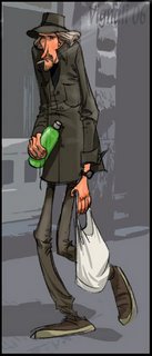
We had to reschedule our Sketchclub lunch for Tuesday because of some upcoming company plans on Friday. It was a good time sketching, and a fun "mark" for the memory sketch.

One of the first things I do when memorizing the "mark" is try get the initial first impression. What is their attitude and their mood, and what is my impression of their presentation? That's where I start, and then I try to memorize the hairstyle, clothing, shoes ... gesture or funny walk.

Go to Sketchclub.blogspot to see how the drawings compare.

--Marcelo

4 comments :

Centaur Ranger

1 comment
Here's another card I've painted for Wizards of the Coast. The assignment was to paint a centaur ranger with mystical powers ... hence the smoke and the glowing eyes. That was part of the requirements for this piece.

I placed the centaur in a crevasse, as though we had suddenly come upon him as we were trudging through the snow. Here, reaching into his quiver, holding an antler bow, he stops us. It's that moment, "Friend or foe?"

1 comment :

The Latest Post at Sketchclub.blogspot

9 comments
Check out the latest memory sketch at sketchclub, and see how they compare. I had a sneak peak at Marcos' sketch (don't worry, I wasn't cheating ... I already had my sketch done), and it's a good one.
--Marcelo

9 comments :

Death Head Buzzard

5 comments
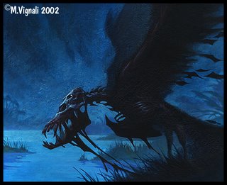
This image was done for Wizards of the Coast back in 2002. And, sadly, this is one of my last acrylic paintings. Since then, I've gone the digital route for the sake of expedience and flexibility, but there is something charming about the surface and texture of physical paint verses digital paint. Of course, the image you are looking at had to be digitized, so it makes the surface irrelevant to anyone surfing the net. But, there is a certain electricity you get when holding an original painting in your hands.

Anyhow, when I was trying to come up with an idea for this zombie buzzard, I thought it would be fun to give the bird teeth as opposed to a beak. This helped to create a more menacing and surreal look. The first rendition had a lot more detail, but I knew it would have to work at a very small size ... so I painted most of the detail away in order so that it may read clearer and more graphic at that small size. It's always disheartening painting over an area you like, but in the end it's for the better.

--Marcelo

5 comments :

Figure Drawing

7 comments
After I completed my formal art training I went to work in the entertainment world. Unfortunately, when I started working, I realized that I was ill equipped for the profession I had managed to talk myself into. Thus, began my effort to fill in the gaps that my formal education failed to fill.
At this time, late 1989, I began going to a figure-drawing lab that Walt Disney Imagineering provided. I say "lab" as opposed to "workshop" because it was uninstructed; it was simply a place where a figure-drawing model showed up, where a model stand was provided along with drawing horses and a spot light.

The class was in the evenings, and not a whole lot of people had the discipline to go after putting in a hard days work (that's where I met Hans Bacher and Andreas Deja). I began attending regularly, but I soon noticed that there were many interferences that seemed to prevent me from attending regularly. It was at that point that I realized that I would have to be unreasonable if I were going to attend figure drawing regularly. Basically, there was no reason good enough to skip even one class. I resolved myself to attend these drawing sessions, and nothing would deter me.

Why, you might ask? In truth, I had no understanding of why it was important or relevant to my craft ... I just figured that if the old masters diligently studied the figure, it was a good thing. Three years later, after my diligent weekly attendances, it all began to make sense to me. I realized that I wasn't drawing the figure, I was designing the figure.

Ever since 1989 (not including the four years of figure drawing between 1983-1987 at my lousy art school ... which I would prefer not to mention), I've been figure drawing regularly, and recommend it to anyone starting out in his or her professional career.

--Marcelo

7 comments :

New Sketchclub Posting

2 comments
Don't forget to check out Sketchclub.blogspot to see how our memory drawings compare. I've provided a link to make it easier.
--Marcelo

2 comments :

Moto-Girl

6 comments
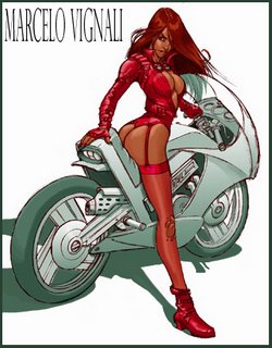
Here's an image I did a few years back for a gaming company. I can't remember which game the design was for, but the creation of the character, clothing and motorcycle were left up to me.
This is where all those figure drawing classes come in handy. No reference was used for the figure.

--Marcelo

6 comments :

The Big Big West ...

9 comments
All right ... after a few E-mails and verbal requests, I thought I would go ahead and post the entire western image. Sorry for the watermark, but I've been planning to make prints of this image and I don't want to post a high res version on the blog. However, this allows you to see the total composition.
--Marcelo

9 comments :

How The West Was Drawn

14 comments

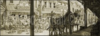
I thought I would go ahead and post a portion of this image. Mind you, the entire image is HUGE. A friend of mine commissioned me to do an illustration for his home decor. The requirement was that the drawing had to be seven feet across by 2 and a half feet tall. Well, being someone to never shy away from a challenge, I drew a gigantic pan of a western town ... with just about every cowboy movie clique in it! This selection I'm sharing with you is perhaps an 18 inch (maybe two feet) portion of the total image.

It was quite a task because the image is a pen and ink with sepia wash. I first roughed out the image on a cheaper paper, and then transferred the rough using my light box onto a high quality 100% rag Strathmore paper. To do this, I had to roll up the drawing, and then unroll it in sections over the light box to pull it off, but I managed to transfer the image. Then, I tightened up the drawing and inked it.

--Marcelo

14 comments :

Sketchclub Posting

4 comments
This is my latest sketch that I've posted at http://Sketchclub.blogspot.com. Stephen Silver and I created Sketchclub out of an exercise I developed years ago.

When I first started figure drawing on a regular basis, I tried to find new ways to challenge myself in order to better retain the information I was drawing. During figure drawing classes I would draw the pose, but then during the model's break in-between poses I would try to draw some of the poses strictly from my memory. This was a great exercise because it showed me all the weakness in my drawing. I would later compare my memory sketch with the sketch drawn only minutes earlier, and there was a drastic difference in quality and understanding. The exercise illustrated to me where I was knowledgeable in anatomy, and where it fell apart for me.

It was amazing how quickly my mind would begin to pay attention to the shapes, and how similar my memory sketches began to look like my visual sketches. So, I began to extend the exercise until the next day. I would try to visually memorize a particular pose, and then the next day I would try and draw the pose from memory. This exercise really helped me to work on all those areas where my knowledge of anatomy was deficient.

Years later, while walking back from sketching with Stephen, we thought we would employ that exercise by memorizing someone, right down to the details, and then sketch them from memory. For people who like to sketch, this was a source of great amusement ... hence we thought other art nerds would like to see the sketches as well. The best part is the comparisons. The goal isn't to make a silly sketch, but to make a silly accurate sketch. Not only draw the likeness of someone, but capture their personality, posture and feeling.

Anyway, if you'd like to see some of those sketches from the early days, go check out our Sketchclub blog.

--Marcelo

4 comments :

Lava Giant

6 comments
This image was created for Wizards of the Coast collector gaming cards. The assignment was to create castle guards killing a giant lava creature. Even in death, the creature can be very dangerous as its blood is made of molten lava.

The first problem I encountered in having a group of smaller castle guards lancing a giant creature is the sympathy factor. The original design for the lava creature made the creature look sort of like a slow, dim-witted creature. That's fine for a stand alone design, but in my preliminary sketches for this illustration it appeared as though this dim creature was being picked on by the guards. So, I altered the original design of the creature, and sketched up several compositional variations that made the creature look menacing, quick and imposing ... like he's just about to take out a few guys on his way out. Jeremy Cranford, one of the art directors, agreed with the changes and allowed me to complete this image.

This was one of the first digital paintings I did, and "The Great Paul Lasaine" was kind enough to show me some Photoshop tools that would create a glowing lava effect. Thanks Paul!

I'll be posting some of the other images I've done for Wizards of the Coast, and perhaps a little bit of the thinking that went along with the assignment.

--Marcelo

6 comments :

Whale of a Promo Card

6 comments

When I was freelancing from Utah, advertizing was part of what I had to do to rustle up work. I created this image to use as a promo card and mailed it around to potential clients. I also sent this to some publishers in New York in the hopes of getting some illustration work.

During the Golden Age of Illustration, black and white illustrations were used to illustrate a lot of the novels of that era. I thought this image evoked some of the romance and drama of that by-gone era. Well, suffice it to say, I didn't get any work from New York .... now I know why we don't see this type of imagedry, plain and simple they don't want it.

--Marcelo

6 comments :