Flickr Images

https://www.facebook.com/vignalistudio/ https://www.youtube.com/channel/UCL7SU_6-cxyuVEIHcV1nsiA
Here's a snapshot of Armand Serrano, Paul Lasaine, and myself (pictured from right to left) doing our Surf's Up signing at the San Diego Comic Con.

We got to meet quite a few of animation fans, and were able to sign several posters and books for two hours solid. That's no surprise, since the Comic Con enjoyed record attendance this year -- and sold out the convention center on Saturday. It's a far cry from the first time I went to the San Diego Comic Con in 1987!

Despite being there since the convention opened on Friday at 9:00 AM, I was unable to see the entire show. Regrettably, there was so much that I missed. I'm definitely going to have to book for more than one day.

SURF'S UP CREW AT COMIC CON

You are all invited to to stop by the Sony Pictures booth this Friday, July 27, at the 2007 San Diego Comic Convention.

Please stop by and say hello. Paul Lasaine, myself and Armand Serrano (all pictured above) will be there to do a book signing for the Surf's Up making-of book. The Sony booths are located at 4137 and 4419.

(This picture was taken three years ago at a surfing contest while we were doing research for our film.)

SURF'S UP BOOK SIGNING AT COMIC CON

Here's another drawing I did for Brother Bear.

I really enjoyed working on this project, and the people at the Disney Florida studio really treated me well. I worked with Producer Chuck Williams, directors Aaron Blaise, Bob Walker, Robh Ruppel and Bob Stanton; they are all top-drawer in my book. They allowed me the time to explore the animals and the world; I felt as though I really got to sink my teeth into the designs.

I didn't know Armand Serrano then, but he also worked on Brother Bear too.

I drew this one on vellum, but for the blog I went ahead and layered it with a colored background and tinted the linework. However, the drawing is untouched. It is as I drew it seven years ago.

MAMMOTH Drawing

Here's one from the Vignali Vaults. I found an old disk with some drawings I did for Disney's Brother Bear.

During this period I was living in Utah and was working as a freelancer for Disney. It was a good time in my life. My daughter was four years old and she would play in my studio as I worked at my drawing board.

Anyhow, I saw this image and remembered how much I enjoyed drawing it, so I thought you all might like to have a look at it. By the way, this was not printed in the making-of book for Brother Bear -- and Disney has the original.

I drew this one one with Prisma Pencil on tracing paper, hence the ripple when I scanned it. The moisture of my hand buckled the paper just a bit.

(Simon Rogers came by and looked over my shoulders and said I was cheating by posting this old stuff. He was just kidding of course, but how fortunate I am to have such talent around me! I have Simon Rogers, Armand Serrano, Noelle Triaureau, Marcos Mateu and Jed Henry -- who's work you can see posted on Blogger -- in the very same building along with me.)

A MAMMOTH Sketch


Go to Sketchclub to see the full version.

...'Nuther One

Go to Sketchclub! .

I Have Posted At Sketchclub...

I was just doing a little exploration, with no particular direction in mind. However, I used to work with *Zipitone way back when, and thought I would try to emulate the look with Photoshop.

*I'm not sure a lot of you know what Zipitone is/was. Back in the day, the printing process was separated using mechanicals. Depending upon the quality of the paper, you had a different "line screen." Zipitone was a sticky backed acetate that had little dots printed on it; it came in different line screens so artists could prepare their mechanicals accordingly. The sheets of dots came in different values, so after you did your drawing, you could lay down the Zipitone and cut out the value where you needed it.

Just Doodlin' in Photoshop

In coming up with the look for Surf's Up competition beach during the visual develoment phase of the project, I wanted to create something audiences hadn't seen before in a film. I used the Islands of Seychelles, with its white sand beaches and sandstone boulders, as the inspiration for our beach.

Here's a shot from Seychelles. This choice afforded me the opportunity to use the large boulders as our judges booth, and really frame our sandy beaches in a way we've never seen. But, even still, I was looking for something more iconic for our island, something that could evoke both history, and mystery...so I dropped in some "Easter Island" looking stone penguins in the background.

I also used smaller rocks to frame the competion beach's bleacher area in a natural looking terrace. The final design was modified a little to fit the story, but the end result is more or less the same. I had a look at our film during the premiere, and I'm really pleased with the final result...it looks spectacular on the big screen.

Another Surf's Up Exclusive Drawing

This is fairly recent artwork for the soon-to-be-released animated feature, Surf's Up. You won't find this image in the Surf's Up book!

This image didn't make it to the book, but a colored version of this image is printed on page 105. The image in the book is the final image that was used for design, but the image I'm posting here is the original pencil drawing I did for the concept. I was asked to remove the tiki totems for the final, and there were some other alterations. If you have the book, you can compare the two images.

Exclusive Surf's Up Artwork

Check it out, the Making-Of book for Surf's Up is finally here, and not a moment too soon because the film's release is right around the corner. Coming at you on June 8th!

As some of you may or may not know, I was one of the two art directors for the picture. As art directors, I handled the designs while Ron Lukas managed the color. And, if I may say so, this is one of the best looking films I've had the privilege of working on.

In terms of looks, I think our film is perhaps one of the best-looking CG films since Finding Nemo. Hopefully you'll see for yourself when the film comes out. The story is pretty funny too, and the "reality TV/surfing documentary" approach is a fresh way to present an animated film.

The book has a ton of great looking visual development artwork, featuring artists like "yours truly," Paul Lasaine, Ron Lukas, Armand Serrano, Marcos Mateu, Joty Lam, Noelle Triaureau, Richie Chavez, Sylvain Deboissy. Also, lots of story sketches and CG models and renders.

The people, who put this book together, are the same group that put together the Open Season making-of book. So, that should give you an idea about the quality of this book. Again, like the Open Season book, it's got lots of stickers, pullouts, accordion folds, and post cards.

If you're interested, just click on this Surf's Up link.

THE SURF'S UP BOOK IS OUT!!!

Here's the latest Sketchclub victim.

Whadda character. Stop by and visit SKETCHCLUB to see how our memory drawings compare.

A new post on Sketchclub

Yes, I know, it's been a while, but I have posted my memory sketch at our Sketchclub blog...along with Sketchclub's newest member, Craig Harris.

Stop by and visit SKETCHCLUB to see how our memory drawings compare.

I have posted at Sketchclub

Alright, and here's a close up look at the detail.

I know...most of this small detail stuff is lost on the small card, but hopefully it makes the card interesting enough that kids will get their noses close enough to see some of the information. Maybe it's just wishful thinking on my part.

I surprised myself by how well the bears turned out. After having drawn bears for Brother Bear for Disney, and then more bears for Sony's Open Season, I've gotten to know the structure of bears pretty well. So, I just "winged" the bears from memory.

By the way, this image I'm posting is taken from my actual illustration. Yes, I know, it's much darker than the printed version. I painted it darker, but unbeknownst to me someone at the Warcraft studio made the decision to lighten the image when it went to print. Personally, I like it better darker because it makes the image more mysterious. It also makes the focus of the image much clearer.

Wakening Close Up

Here's another card I did for Warcraft. I'm putting up the German version because it's closer in color to the original, verses the card in English.

Here's a little insight into my process:
When I got the asignment, I was a little intimidated by the scope. I had to paint an elf and pet wolf inside a cavern, surrounded by giant bear-like furbolgs. The object of the card is overwhelming odds -- but the elf and wolf are up for the challenge. The text described the situation as a "sea of furbolgs." (That's a lot of painting!)

I typically start my assignments by sketching my first impression. Once I drew this composition -- with all it's complexities -- I realized this was the one to paint.

The Relics of Wakening

Ladies and gentlemen, Sergio Martinez has a blog!

Please stop by and visit with Sergio, he's one of my favorite illustrators. His style, mood and classy images are second to none. I've got a bunch of his illustrated children's books.

Just click on Sergio Martinez to see this blog.

The Amazing SERGIO MARTINEZ

For those of you interested, here's a close up of the Dwarf I painted for World Of Warcraft.

Dwarf Close Up

Hey, check out this link my friend Paul Wee sent me. It's a web site with an interactive anatomical reference model.

Each anatomical model can be rotated around as though it were on a spinning table.

Just click on Pose Maniacs to see this blog.

Interesting Link

Here are a couple of images I did for Warcraft. If you collect the cards, or play the game, you might already own a few.

These are currently on sale now in the Dark Portal card game campaign.

I have to admit I don't play the card game, or play the computer game. I did play Warcraft II years ago, and that was hugely entertaining, but in Warcraft III the game changed and it wasn't the same. I've been wanting to find a Warcraft II game that will play on my OS 10.4.8. Maybe some of you know where I can find it. I would think it might get bundled with other Mac games.


The second image was a pretty odd illustration assignment. I had to paint a dwarf enjoying some grog. So, I thought it would be funny to make it look like a beer ad. I love my job, where else can I paint a beer ad for dwarves? I did a couple more illustrations that I'll be posting soon. I'm saving the best for last.

New Warcraft Illustrations

Since I'm in the mode of posting faerie doodles, here's another another one.

A couple years back I thought I might end up working on a faerie world project, and so I had contemplated how I would design this world. The project ended up not going anywhere (and in the end dried up and went away), so the images of beautiful faeries were all bottled up in my mind...hence the doodles.

I added a little muted color in photoshop, but little faerie doodle is as it is.

Still More Faerie Doodles

Paul Wee is a tremedous artist, and he also happens to be one of my oldest and dearest friends.

Paul and I went to art school together, and shared a lot of the same teachers. At one point we even lived together in a really scary part of Los Angeles, heh-heh, I've got a few funny stories about the time we got broken-into, the dead body in the parking lot, and about the earthquake. Ah, the good old days. Paul and started our professional careers in the same studio, and used to carpool into work back in those days.

Fast forward 24 years later, Paul Wee now has a blog. Please stop by and say hello. Just click on Paul Wee to see his blog. I've also linked him on my site.

Introducing PAUL WEE

Here's another doodle I found while cleaning my office. I thought it went nicely with the other faerie drawing I did, so I decided to post it. I was lazy, and didn't finish the wings -- but that's the beauty of doodles.

I went ahead and Photoshopped in some nice manilla paper, some texture, and some text, but the drawing is untouched and is as it appears on my paper. It was originally drawn in graphite, along with graphite smudges.

I normally draw with a piece of paper under my hand to keep me from smudging my artwork, and this doodle was drawn on that paper, that's why there are so many graphite smudges alongside the drawing.

Another Faerie Doodle


My friend David Colman put a book together of many of his doodles, life drawings and animal sketches. I would recommend this book to anyone interested in the character design and visual development (and, Bud Plant also recommends the book too). You can find the book on the web at Bud Plant, or at David's site. That's right, go to David's Doodles to buy this book.

David and I worked together on Sony Pictures Animation's Open Season and Surf's Up. He's a tremendous talent.

Buy This Book!

I was cleaning out my office because they are moving me to another office just a few doors down from where I was. I'm really happy with the room because this room has so much light.

As I was cleaning my office, I came across a ton of doodle sketches I've done. Some for work -- others for play. I thought I would go ahead and post this one I did of a little faerie. I kept the fold across the drawing (rather than Photoshop it out) because it authenticates this doodle.

Never underestimate the power of the doodle. I once had colleague confess to me that he never doodles because he only draws when he gets paid. After which, he plummeted in my esteem. My view of him was later verified when I had the chance to work with him and found his talents only technical – with very little imagination.

For those that want to become visual development artists (or better put, visual problem solvers), it is imperative to doodle. Without doodles an artist cannot cultivate the fertile soils of his/her imagination, but instead will be left to toil in weeds of their self made desert.

Cleaning Out The Office

Greetings everyone. This is a figure drawing I did last year. It was probably about five minutes or less. Like I said before, our figure drawing class at work doesn't have poses that last much longer than five minutes. On occasion, we may stretch it out to seven or eight, but this one looks like a five minute sketch.

More Figure Stuff

I feel so guilty, I haven't posted since January! Sorry about that everyone.

I drew this one way back when I was working for Disney's Lilo & Stitch back in 1999. I did several drawings for the project where I just took my pencil and my imagination, and wandered around Lilo's town trying to imagine the world from her point of view. I did a aerial shot of her town with a gas station at the entrance. So, this drawing represented Lilo's perspective on the gas station.

I figured she would have the town all scoped out from her sense of priorities. Here, the gumball machine and drinking fountain were the subject of focus. Each one framed in shadow, with the lighted areas blown out. Look at the graphic shape of the light against the counter, notice how I was able to isolate both props, while directing the eye on both items at the same time. I let the light touch the foot of the gumball machine and the corner of the water fountain to hold our focus.

I think it also helped that my dad used to run an auto bodyshop. I used to work there during the summers -- and carried the scent of motor oil in my hair and skin, even after I showered. Even today, when I smell an auto shop, it immediately takes me back. I didn't come from an art family, and THIS was my background growing up.

MORE LILO & STITCH


I drew this one for Disney -- *gasp* ten years ago! Oh, I feel old, especially since my birthday is coming up this Sunday; I'm going to be 42.

OK, when I drew this one back in the day when visual development was drawn on "papyrus," I was playing around with the composition. There are rules about staging, silhouette, composition and focus, and then there are opportunities when you can break them. This was such an occasion.

I wanted the focus to first go to the view of the little harbor, but I slipped a couple subtle silhouettes of some of the characters in the foreground to take you into the foreground – allowing them to become the second-read.

I think I mentioned it before that I really enjoyed working on Disney’s Atlantis. It’s just a shame the story didn’t hold together as well as most of the designs and animation.

I drew this one with graphite and ink and brush on ledger paper.

Atlantis, The Discovery

Remember that event in December at my church where they built a little Bethlehem town -- and my daughter and I performed as the flower vendors? Well, this past weekend we had our wrap party for the cast and crew. We got to see slides and a video presentation of our four days during the event. We also had a chance to mingle with each other, swap stories and eat desserts.

Afterwards, our church gave out the Golden Shekel award to the most spirited contributors, as in organization, construction, training, contribution and performance. Guess what? I won the Golden Shekel for the best performer! It helps that people can't win the award more than once, but I got it!

I won the award for being the nutty flower vendor that wouldn't take "no" for an answer.

I’m not going to kid myself, it’s not the Academy Awards, but you should have seen the expression on my kid’s faces! It might as well have been the Academy Awards when they called me up to the lectern! They were so proud of me, it was an incredible feeling to give them that experience. I always tell them to do the best they can at what ever they do, and here I had a chance to show them that I practice what I preach. The award proudly sits atop our mantle at home...where the kids can see it.

The Golden Shekel Award

Here's one you won't find in the Open Season book. Actually, the image is in the book, but it is a painted version by then-production designer, Michael Humphries. (By the way, he did a beautiful job using traditional media.)

I highly recommend getting the book, I have to say, it is by far the best Making-Of book I've ever seen, it beats out any Disney Making-Of book. Not only is the artwork stunning, but the way the book was packaged, presented and designed is truly a gem. This book is a must see!

I digress, I drew this image as a test. We were trying to figure out how to stylize the edge of water in how it interacted with the shoreline. We were also testing reflections, atmosphere and of course the stylization.

The end result was stunning -- too bad no one other than us in vis dev had a chance to see it. But, if you saw the movie Open Season, you saw the fruits of such exercises and tests.

The image was drawn using graphite on ledger paper.

Open Season Artwork

I thought I would go ahead and post a sketchbook page from my Sketchclub sketchbook (try saying that three times fast!).

These were drawn during our Friday get together lunch we call Sketchclub. You see, the first part of Sketchclub is dedicated to good food, good friends, and some fun drawing. We have to draw these without being spotted, so sometimes I draw with my sketchbook on my lap and the book nearly concealed under the table. Unless I can find a wall to sit up against so no one can sneak up behind me and say, "Hey, my nose isn't that big!" Fortunately, I draw with a very intense expression on my face, which tends to frighten off most lookie-loos. Only the bravest approach me.

The latter part of Sketchclub is the part when we draw someone from memory. If you want to see some memory sketches, check out the link on the left hand side.

Happy New Year everyone! CHEERS! ...here's to another year of fun blogging.

Happy New Year

Hey, that guy looks familiar!

My church, Journey Of Faith, put together a wonderful Christmas event this December. You can check them out at Journey To Bethlehem to find out more about the event.

In a nutshell, my church built a mini version of Bethlehem in their parking lot and opened the event to the public for four days -- and my oldest daughter and I were flower peddlers during the entire four days. (Note: We were going to be shepherds, but my daughter broke her ankle a month before the event so we had to find a more sedentary role. Flower peddlers turned out to be the logical choice.)

The event was a wonderful way for our church to remind Christians what Christmas is all about, and a fun way for families of any denomination to spend their December evening. When guests entered the event, the Three Wise Kings (complete with camel) gave them five shekels. When they entered the gates of Bethlehem they had to pay one of those shekels to the Roman tax collectors conducting the census. (The Roman guards were a hoot, they looked like a couple of linebackers -- and the guy played the part of Governor Quirinius was probably 150 pounds soaking wet.)

Once inside, the guests could spend their shekels on any of the many activities. For one shekel, guests could buy baklava, hot cider, fruit, bread and cheese, or a flower. The kids could also use the shekels to buy a leather strap and some beads to make a bracelet, make mud bricks, make a clay pot, or to enter the petting farm.

Also, during the course of the event, Joseph and a very pregnant Mary would weave their way through the crowds on a real donkey -- asking if they could stay the night somewhere. Our job as citizens of Bethlehem were to direct them to the inn, but when they got there they would be told there was no room, but instead were offered the stable.

Once Mary and Joseph were safely inside the stable, angels would appear and announce the birth of Jesus Christ using the verse straight out of the Bible. Guests would then line up at the stable to see the Baby Jesus. We even had a couple real babies play the role!

Happy Holidays to all my fellow blogger friends, Merry Christmas to my Christian friends, and a Happy New Year to one and all!

I kinda like this not-shavin'-deal!

Journey To Bethlehem

Here's one I did back in 1999 for Lilo & Stitch.

I wanted to create a soft ambient glow, so I drew this one with vellum and black Prisma pencil. You can compare this one with the graphite drawing a couple installments below.

Hawaiian Cafe

Here's my memory sketch that I have posted at SKETCHCLUB , have a look at what everyone else did...when they post.

I have posted at Sketchclub

I thought this image appropriate for the anniversary date. A friend of mine just went to the Joseph Christian Leyendecker show and said it was well worth the trip to see it. The show is going to be traveling around, so it would be a shame to miss if it comes by your town.

For those of you that don't know who is he is, J.C. Leyendecker was the premiere illustrator for the first half of the last century. Essencially, the most emulated and respected illustrator of the golden era of illustration. Check out his biography at: http://www.bpib.com/illustrat/leyendec.htm

Here are some blogs with photos!

http://www.louisgonzales.com/blog/?p=33

http://www.louisgonzales.com/blog/?p=36

http://www.louisgonzales.com/blog/?p=37

J.C. LEYENDECKER SHOW

I thought I would go ahead and post some of my old Disney stuff again. I did these drawings while doing some exploration for one of their projects back in 2000 (wow, can you believe it's going to be seven years ago!). Mind you, these two images were for the same project.


I varied my style so that the directors would have more to choose from: from the stylized, to the idealized.


Both of these were done in graphite on ledger paper. Since these were loose sketches, there was no need to polish the drawings with Prismapencil and vellum.

A Varied Approach

I thought this girl had a striking look when she entered the restaurant during Sketchclub. After sketching her, I realized that she looked like a cartoon burglar -- with her knit cap and striped shirt.
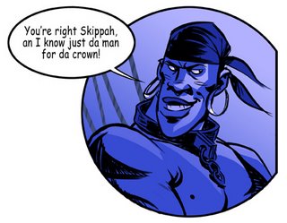

Hello everyone, It's been a little while since I posted anything...forgive me. So, I thought I would go ahead and post a sketch from my sketchbook. This isn't a memory drawing like the ones I post on Sketchclub, this drawing was done while seated in the restaurant. This is the fun part of Sketchclub where we all sit, eat, draw, and make merriment! It's a rollicking good time and the highight of my week. As a matter of fact, I refilled my ink pens on Tuesday in anticipation for Friday's Sketchclub!!!

Burglar Girl

I have posted at: El-Pacifico Our on-line gratis comic continues to sail into adventure.

I haven't been able to do any posting on our El-Pacifico blog for the reason that I ended up picking up some freelance fantasy illustration work. I had been asked to do some full color illustrations for Warcraft, who are going to be getting into the gaming card business. If you've played the game, then you know the sort of fun look the cards are going to have. Since the debut of the cards is being kept under wraps, I can't post the illustrations on my blog until after they are on the market.

I have also posted at: Sketchclub

The Return of Dinga-Man

Here's my version that I have posted at SKETCHCLUB , have a look at what everyone else did.

We have posted on Sketchclub...

At Sketchclub we had an all-star group of professionals join us. This is my version, come take a look at the other versions of the same memory drawing.

CELEBRITY SKETCHCLUB SESSION!

Here's one I did for Kingdom of the Sun, which used to be called Children of the Sun, then Children in the Sun, but was ultimately called The Emperor's New Groove. Go figure?
We have to go waaaaaay back to 1996-7 for this one. I drew it as a pan starting up from the Machu Pichu city, going up towards the hitching post for the sun.

Again, this was done in Prismacolor pencil on Vellum (or tracing paper, I can't remember). In it I worked out the entrance, town, plaza, and the Temple of the Sun ... and of course the hitching post at the very top.

Kindom of the Sun

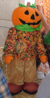
HAVE YOU SEEN THIS PUMPKIN BOY?

I'm in a bind, we bought this 30" or 36" pumpkin plush holiday decoration a couple years ago. My daughter loved it -- unfortunately a few months back we lost "Pumpkin Boy" in a flood we had at the house.

(I know-I know, first flood, then fire. What could we do? We're due for frogs and locus at any moment.)

Thing is, I would like to replace this decoration. If you have seen one at a store, or you have bought one, or your neighbor has one, I would like to buy it from you. I don't care if it's a little worn around the edges.

If you spot one on E-bay, let me know. I keep checking, but I haven't found one yet.

CALLING ALL BLOGGERS

That's right, go to Sketchclub and check out my lastest memory drawing.

As an added bonus, Jeremy Spears drove all the way from San Luis Obispo to come and draw with us at Sketchclub. He's a terrific cartoonist, so if you haven't seen his work, I recommend checking out Jeremy's blog site. So far both of us have posted at Sketchclub, so go and have a look!

I have posted at Sketchclub

It was a dream come true for me! I got to meet one of my personal heroes. From the moment I first laid eyes on Mad Magazine, I was hooked -- and Jack Davis was a huge part of that.

And, as the photo suggests, I got a chance to shake his hand and tell him so personally.

Thanks to CAPS and my friend Stephen Silver for making it happen.

I met JACK DAVIS!

Hello everyone. Marcos was teasing me for having mentioned my dryer fire, at the same time I put up a post. I didn't think about it at the time, but it is funny. "Help, FIRE...oh, by the way, here's another post."

Marcos told me I should have posted the drawing with burned edges.

Anyway, here is a picture of the dryer. Sherri, my wife, said the flames were shooting out of the machine, and she knew if she waited for the firemen to arrive, we might loose the house. So, she quickly filled a couple small buckets of water and doused the fire. It was still on fire when the firemen did arrive, but those buckets-full never let the fire get out of control.

The scary thing is that it is a gas dryer, so if the gas line heated up, it could have exploded. Or, with all the electrical components exposed, when she through the buckets of water on it, she could have been electrocuted or shocked into unconsciousness. Either way, we're lucky "the Mrs." didn't get hurt.

This whole thing sure has scared the kids.

The Dryer Fire

I'm sorry I haven't posted anything lately. I've had a lot going on.
Today, as I was driving home, my wife called me to tell me that we had a fire in our home. Oof, what a mess. There wasn't much fire damage, but lots of water and smoke damage.

I'll try and post something else when I get a chance. For now, I'll just post this figure drawing. This was probably no more than five mintues.

Yet Another Figure Drawing

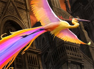
This is an illustration I did for Wizards of the Coast.

Alas, the days of paint and canvas are now behind me. I did this one on the computer using Photoshop. It's funny in a way, I can paint on the computer, but I still don't like to draw on the computer.

The client asked to have the images look as traditional as possible, without computer effects and textures, so it's pretty traditional looking, despite being a digital painting. It's so practical doing things digitally. If you save in layers, changes are easier, and mailing your work in is as simple as sitting at your computer drinking coffee while you upload your images onto a server.

The job assignment was to illustrate a fictional, colorful bird that creates a rainbow with its tail. This colorful bird was to bring contrast to the drab/gothic city.

Wizards printed this card as a much-coveted FOIL card!

BIRD OF PARADISE

Open Season opened up this weekend with a respectable $23 million box office gate. Not huge numbers, but it was still number one in the box office. The overall audience response seems to be positive, so hopefully it will perform as well next week (wouldn’t that be a treat for Sony).

Yes, I did character design work for the film while it was in early development. And, although my characters didn’t make it to screen, I got both Boog and Elliot about 75-80% of the way there. Then, the very talented designer Carter Goodrich finalized the style and direction that the characters would ultimately take.

The Open Season art-of book has a lot of my early development sketches.

This is my version of Boog and Elliot.

Open Season's Opening Weekend!