Flickr Images

https://www.facebook.com/vignalistudio/ https://www.youtube.com/channel/UCL7SU_6-cxyuVEIHcV1nsiA
That's right, go to Sketchclub and check out my lastest memory drawing.

As an added bonus, Jeremy Spears drove all the way from San Luis Obispo to come and draw with us at Sketchclub. He's a terrific cartoonist, so if you haven't seen his work, I recommend checking out Jeremy's blog site. So far both of us have posted at Sketchclub, so go and have a look!

I have posted at Sketchclub

It was a dream come true for me! I got to meet one of my personal heroes. From the moment I first laid eyes on Mad Magazine, I was hooked -- and Jack Davis was a huge part of that.

And, as the photo suggests, I got a chance to shake his hand and tell him so personally.

Thanks to CAPS and my friend Stephen Silver for making it happen.

I met JACK DAVIS!

Hello everyone. Marcos was teasing me for having mentioned my dryer fire, at the same time I put up a post. I didn't think about it at the time, but it is funny. "Help, FIRE...oh, by the way, here's another post."
Marcos told me I should have posted the drawing with burned edges.

Anyway, here is a picture of the dryer. Sherri, my wife, said the flames were shooting out of the machine, and she knew if she waited for the firemen to arrive, we might loose the house. So, she quickly filled a couple small buckets of water and doused the fire. It was still on fire when the firemen did arrive, but those buckets-full never let the fire get out of control.

The scary thing is that it is a gas dryer, so if the gas line heated up, it could have exploded. Or, with all the electrical components exposed, when she through the buckets of water on it, she could have been electrocuted or shocked into unconsciousness. Either way, we're lucky "the Mrs." didn't get hurt.

This whole thing sure has scared the kids.

The Dryer Fire

I'm sorry I haven't posted anything lately. I've had a lot going on.
Today, as I was driving home, my wife called me to tell me that we had a fire in our home. Oof, what a mess. There wasn't much fire damage, but lots of water and smoke damage.

I'll try and post something else when I get a chance. For now, I'll just post this figure drawing. This was probably no more than five mintues.

Yet Another Figure Drawing

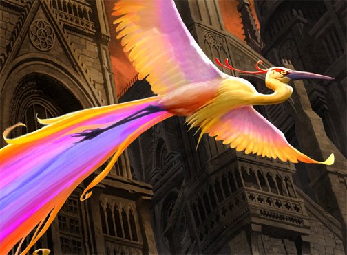
This is an illustration I did for Wizards of the Coast.
Alas, the days of paint and canvas are now behind me. I did this one on the computer using Photoshop. It's funny in a way, I can paint on the computer, but I still don't like to draw on the computer.

The client asked to have the images look as traditional as possible, without computer effects and textures, so it's pretty traditional looking, despite being a digital painting. It's so practical doing things digitally. If you save in layers, changes are easier, and mailing your work in is as simple as sitting at your computer drinking coffee while you upload your images onto a server.

The job assignment was to illustrate a fictional, colorful bird that creates a rainbow with its tail. This colorful bird was to bring contrast to the drab/gothic city.

Wizards printed this card as a much-coveted FOIL card!

BIRD OF PARADISE

Open Season opened up this weekend with a respectable $23 million box office gate. Not huge numbers, but it was still number one in the box office. The overall audience response seems to be positive, so hopefully it will perform as well next week (wouldn’t that be a treat for Sony).

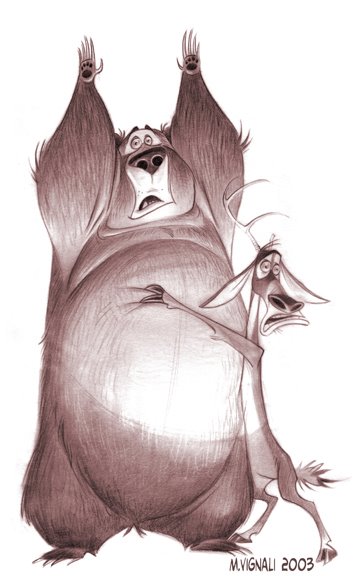
Yes, I did character design work for the film while it was in early development. And, although my characters didn’t make it to screen, I got both Boog and Elliot about 75-80% of the way there. Then, the very talented designer Carter Goodrich finalized the style and direction that the characters would ultimately take.

The Open Season art-of book has a lot of my early development sketches.

This is my version of Boog and Elliot.

Open Season's Opening Weekend!

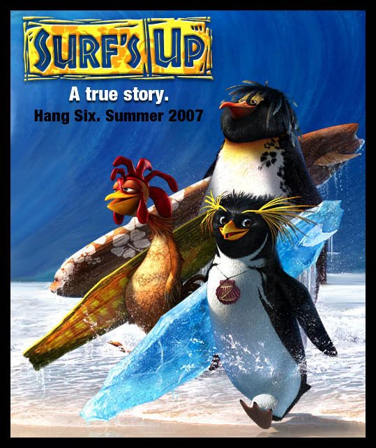
This weekend, Open Season is going to be released in the theaters. Although I'm proud of the work I've done on that project, I'm even more excited to see that Sony is going to be releasing our Surf's Up trailer for next year's feature animated film.

For the past two and a half years I've been one of the art directors for Surf's Up; I'm telling you the film will blow your mind!

Take a look at the Surf's Up trailer.
This movie will be like going on vacation to an island in the South Pacific!

SURF'S UP

I know you've all been waiting for this, because I've been waiting for this. I've been trying to goad Marcos Mateu into starting up his own blog for months, and finally the nagging has paid off.

This is going to be Marcos' own personal blog where he is going to post sketches, artwork, doodles -- and his own on-line "improvisational" comic book!

Marcos is one of the top talents in the animation industry, and one of the most talented individuals I've ever had the pleasure of working with. On top of that, he's a great guy and a good friend. So, please stop by http://www.marcosmateu.blogspot.com and say hello.

Without further ado...

Take me there now!

NEWS FLASH...MARCOS MATEU HAS A PERSONAL BLOG!!!

If you want to see the complete image, just click on this link... I gotta see it NOW!

A new post on Sketchclub

Due to popular demand, I thought I would post few more drawings from my sketchbook. The figure drawing model wasn't very exciting, so...I decided I would turn the tables and draw some of the artists.
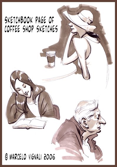
These were drawn with marker and ink.

Head Sketches

As you know, our Sketchclub group goes out every Friday to draw in our sketchbooks. Marcos has been bugging me to post some of these sketchbook sketches, so I've gone ahead and put one up. This is taken directly from my sketchbook. This is how I laid it out on my page.
Coffee Shop Sketches

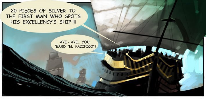
You're looking at a beautiful painting by Marcos Mateu that we have posted at http://www.el-pacifico.blogspot.com

I know it was my turn to do the next installment for El Pacifico, but since I've been swamped as of late, I just couldn't do it. So, Marcos and I did a collaboration on this one. I had roughed out a page, and Marcos was kind enough to work up the image. Wow, I was blown away at the artwork (better than I could have done). Go and check out the full page!

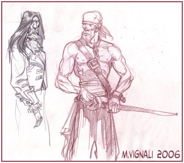
Marcos and I talked about where we would like to take the story, and we've come up with some pretty fun (unconventional) ideas that will take it out of the historical, and move it into the fantasy...without going into full fledged Pirates of the Carribean territory. (Not that we don't like that film, but we certainly don't want to do what's already been done.) To do this, we've added another character, an evil Cardinal to battle with the humble Friars!

Don't forget to check in on El-Pacifico from time to time to see where the story goes.

Marcos Mateu Artwork at EL PACIFICO!

A couple years back, I did some cartoon characters that I thought were worth posting. I love drawing character designs, but I usually get hired to develop concepts and backgrounds instead.

There are a lot of people that draw characters really well in the industry, but good background artists are a little harder to find. Because I do both, I work a lot in Visual Development.

I think what has enabled me to do both characters and backgrounds is that I started out as a character designer for animation in 1987, then over the years I developed my skills as a background designer.

I believe it is easier to come from a character design background and do backgrounds, than it is the other way around. I'm not really sure why, but it would seem when someone starts out doing backgrounds, they have a hard time being able to draw characters.
Another reason I enjoy drawing characters is trying to discover who the characters are. More than just create the design elements that work well together, I have to figure out the character's personality.

Again, these were done old school with ink and marker on newsprint.

Character Designs

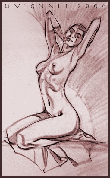
Here's another three minute sketch.

This woman was a lot of fun to draw, she stretched about like taffy! It was relatively easy finding the longest lines and pushing the design.

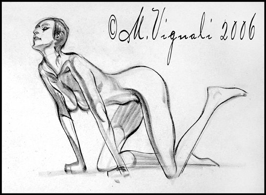
Figure Drawing

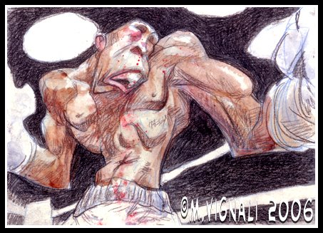
For those of you that don't know me, I'm a huge boxing fan. I did little fighting when I was a young man, and it's been in my blood ever since.

I did this sketch for a friend and mailed it to him via the Post Office. Of course I had to include the new Ray Robinson Commemorative stamp. Not that this is a drawing of Sugar Ray, but rather a just a drawing of a boxer giving it his all.

I used a little Prismapencil and watercolor.

LET'S GET READY TO RRRUMBLE!

No, this isn’t a drawing of 9/11, but rather this was drawn two years earlier for Lilo & Stitch.
When I was working on Lilo & Stitch in 1999, there was a scene where Stitch hijacks a 747 while attempting to escape capture. This ensues a chase scene that takes the jumbo jet throughout Honolulu; in this scene Stitch takes the airliner into the heart of Honolulu.

I was working from Utah at the time as a freelancer, but from what I heard, the entire scene was animated and colored when 9/11 hit. At which point the company knew they could never release the movie with that scene…so it was pulled and redone. The chase scene that ended up in the final version of the movie was the alien spaceship being chased through the Hawaiian mountains.

This was drawn with Prismacolor pencil and vellum. There was no Photoshop or other computer program used to create this effect. It was done purely old-school.

Purely Old-School

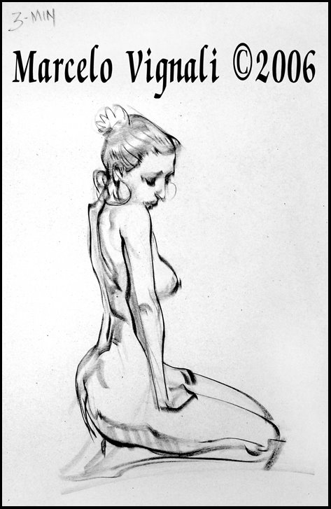
I wasn't sure how much time I had spent on first in this series of three figure drawings, so I estimated that it was between eight minutes or seven, but now I'm doubtful that is accurate. I was poking around my sketch pads and I came across this drawing where I had written down the time limit as three minutes.
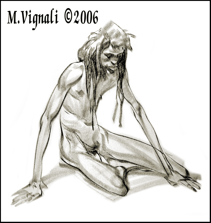
I think I may have estimated that one too high, it may in fact be another three or five minute sketch instead of seven to eight. The seven to eight may be the second posting, and this last posting without a doubt is listed as three minutes.

If I have confused you, that's OK, because it is now clear in my mind...I think.

3 Minute Sketch


O.K. here’s the answer to the question I posed to you all in the last entry. The difference between rendering and drawing is extreme.

Rendering is what most art schools teach. Through careful observation, the artist copies the information in front of him/her by rendering the values and shapes as accurately as they can…sometimes with no real understanding. This is an important skill to master, but it isn’t drawing.

A camera can render, a Xerox machine can render, but neither understands the structure or composition of that which it has rendered. Given enough time, even mediocre artists can render their way out of drawing problems without fully solving them or understanding them.

Drawing is the ability to understand what you are attempting to describe with your pencil, either through line or value. Drawing, such as figure drawing, involves construction drawing, perspective, anatomy, composition and design. Rendering can become part of the drawing, but a drawing doesn’t need rendering in order to work.

THE SECRET REVEALED!


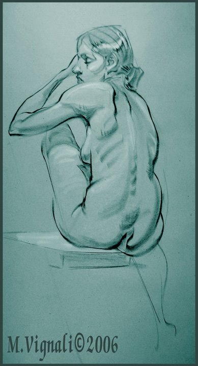
Here's another figure drawing. I can't remember how long it took to draw it, but NONE of the poses are ever longer than eight minutes, and it's been a while since I've drawn an eight minute sketch. So, I'm going to guess it's between eight minutes or seven. Again, there' s not a whole lot of time to work things out, just enough time to practice your proportions and design skills.

This isn't my class, but when I was teaching up in Utah, I typically liked to start with ten three minute sketches, then go to four fives...and then two tens. Having been properly warmed up, the students were now ready to draw. The longest pose my student's would draw would be 20 minutes. This is enough time to do a little rendering, but not enough rendering to hide weakness in their drawings.

Drawing and rendering are not the same thing! Go ahead and post what you think the differences are between the two.

Charcoal Figure (7-8 min)

Here's a figure drawing I did last week.
Having been inspired by Marcos Mateu, I thought I would do some figure drawing with a magic marker.

Figure Drawing

Hello everyone:
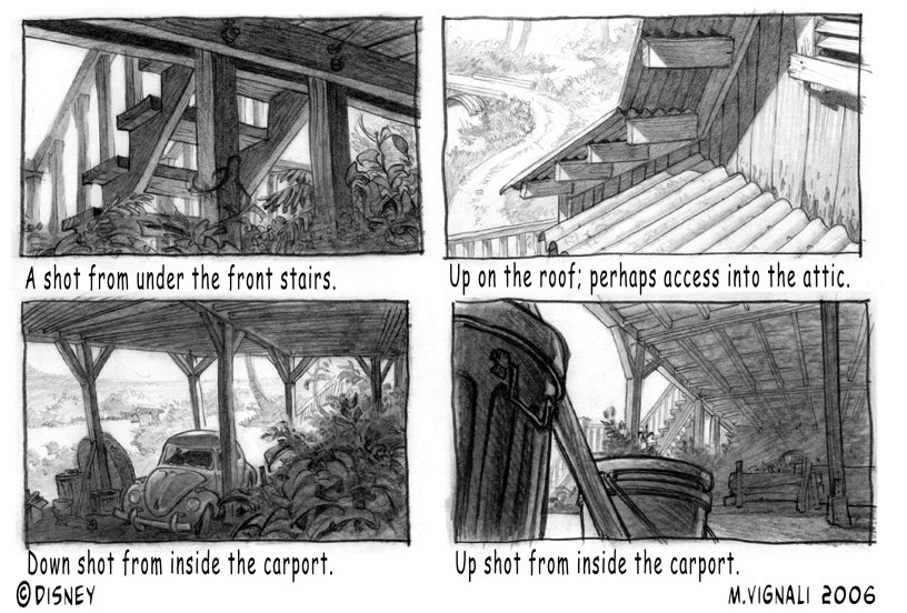
Some people have been asking how I work, and what my roughs look like...so here are a few I did for Lilo & Stitch.

My friend Paul Felix had done an earlier version of Lilo's house that set the style for the architecture, I put it up on the hill with the carport underneath, and then he came back and added the extra room on top. Afterwhich, I took my pencil like a camera and went scouting for location ideas and compositions.

Upon Request...Roughs

For those of you that are unfamilar with Sketchclub, it's a memory drawing game. We spot a person, try to memorize them quickly as we walk by, and then attempt to draw them from memory once we get back to the office. The trick is not to see what the other artists are doing.

Once the drawings are completed, we post them at www.sketchclub.blogspot and...only then... we see how close we came to each other's memory drawing of that person. This is my post, and Armand Serrano will be posting his version soon.

I've posted at Sketchclub too!

Ladies and gents, I've posted my latest installment at El-Pacifico.
If you would like to follow the on-line improvisational blog comic, go to http://www.el-pacifico.blogspot.com, or click on the link provided to your left in the "Links" section.

I've posted at El-Pacifico

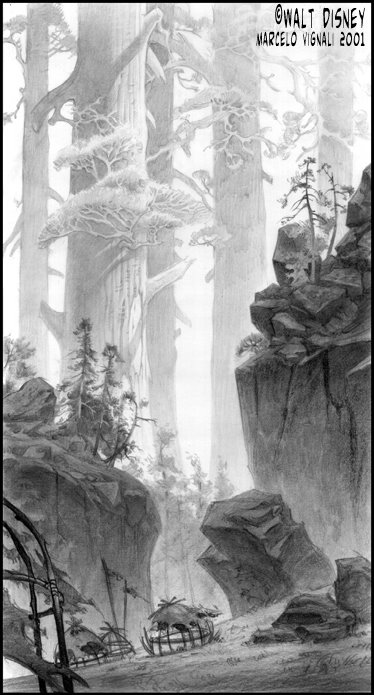
Here's one I did for Brother Bear. I was asked to draw the abandoned human's village.

The initial intent of the directors was to make the landscape look more prehistoric, so I added these giant Redwood trees to make the land look more interesting, I also thought it would give the human world a more diminuative role within nature; I wanted these trees to look like skycrapers.

Sadly, they didn't use the idea and instead went for a more straight foward/natural landscape. My job as a visual development artist is to come up with visually compelling, unique and thought provoking images, and I think this one does just that.

Sky Scraper Trees

Today we had our usual figure drawing class, but the model wasn't very inspiring.
So, I hid in a corner and in a clandestine manner sketched out my collegues!

These are kind of what my sketches look like when I go Sketchclubbing on Fridays.

Figure Drawing Class?

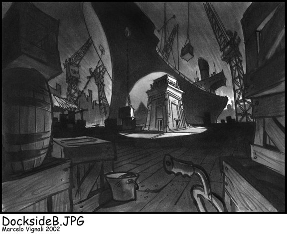
In this scene, the Tut shrine was delivered at the dock.
I did a series of roughs like this, but the client wanted me to pull back a bit on the visual caricature of the backgrounds.

Again, this one was done "old school" with ink and magic marker.

Tutenstein Rough Marker Sketch

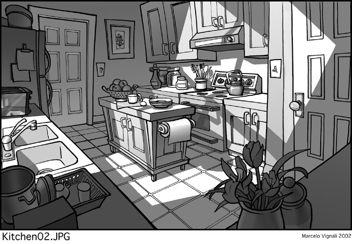
By popular request, here's another one. This drawing actually hooks up with the previous one. If you are standing in the living room, and walk past the TV through the door on left, you would enter this kitchen on the right side. I had done a floor plan to make the whole thing work out.

This image is a daytime drawing, as opposed to the last one. I used the daylight pouring in through the kitchen sink window to create a graphic pattern on the walls and counter.

More TUTENSTEIN

Back in 2002, while I was working as a freelance artist, I did a little work on Tutenstein.

The style of show was simpler than that of Disney, and the turnaround time for these designs was also a lot quicker...as is the case with TV. So, I made the necessary adjustments. The name of the game for a freelance artist is versatility and practicality, and I tried to remain as flexible and malleable as possible to what ever the directors needed.

I kept the backgrounds playful to match the character design style set by veteran character designer Fil Barlow. I drew out the line work, and then simply added simple value tones in Photoshop. There was very little rendering on these backgrounds, rather there was a lot more mask cutting and bucket-fill. Stylistically, it had to have a certain believability and normalcy, so that the fantasy aspects would stand out in contrast...hence the backgrounds are pretty straightforward.

If you are interested in seeing more of these backgrounds for Tutenstein, let me know and I'll see if I can dig up a few more.

I happen to be a huge fan of the Creature Of The Black Lagoon, so I put that on the TV.

Tutenstein

It has been a while since I've posted on Sketchclub, but here it is!

Mark McDonnell from Sketchclub East came to visit our group, and we went out sketch clubbing at lunch. To see how our memory drawings compare, go to http://sketchclub.blogspot.com to see Mark's and Armand's memory sketch.

Whew, I've posted at Sketchclub ...

The saga continues! I've posted another full page of Pirate action at:
http://EL-PACIFICO.blogspot.com

Just cut and paste this link, or click on the EL PACIFICO link provided in the "Blog Links" section.

Another Full Page At EL PACIFICO

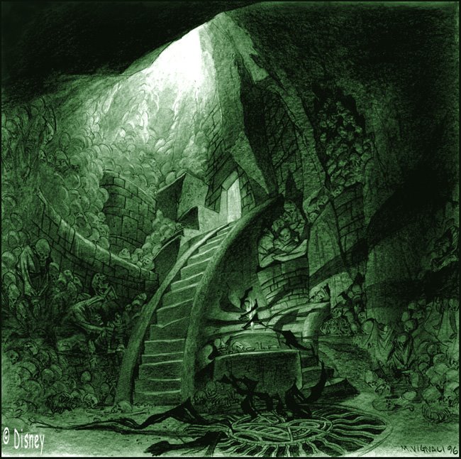
This one goes way back to 1996. (Yikes, a decade, it doesn’t seem that long ago.) I was asked by the director Roger Allers to do some development work on an epic Inca project he was developing at Disney. The working title for the project was, Children Of The Sun, which then was changed to Children In The Sun, Kingdom In The Sun, and lastly, The Emperor’s New Groove.
I worked on Children Of The Sun through its many reiterations, but after about a year of development the project was torn down and rebuilt with new directors and a new comedy direction. At which point I was no longer working on that project.

This was supposed to be Yzma’s lair! I based my imagedry on Inca architecture and sculpture. Through my research I had also learned that the Inca mummified their dead, but they didn’t have catacombs on the scale of Europeans. So I imagined a giant chasm of corpses as a dungeon for Supai (the imprisoned darkenss). I put it all together with the iron grate with an Inca design holding back the darkness. You can see the darkness creeping out of it's prison cell to snuff out a candle light. In this dark and forboding place, Yzma was to conspire with Supai against the Sun Kingdom.

The image was drawn with graphite on Ledger paper.

Yzma's Lair

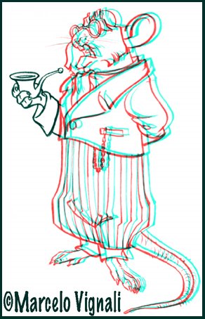
The other day my daughters were watching Shrek 3D. They were wearing those red and blue 3D glasses, and it gave me an idea. I took one of my old drawings in Photoshop and made it 3D. If you have some of those red and blue 3D glasses at home, you might want to have a look at my 3D mouse and see if it's working for you.

If you decide to make a 3D drawing for yourself, let me know in the comments section and I'll go and check out your 3D drawing. Have fun!

VIGNALI STUDIO NOW IN 3D!

Here's one from a few years back.

I was asked to come up with a believable mermaid design for a major motion picture. I can't remember what the title was, but I liked the design and the drawing and thought it would be worth posting.

I believe the drawing was done on vellum and prismapencil.

Mermaid


This drawing was done back in 1997 when I was doing early development work for Disney’s Atlantis.

At one point, the princess was going to die, but be brought back to life by the mysterious crystal around her neck. In a moment of movie magic she is resurrected, and the ancient city is also brought back to life.

This image was done before the characters were finalized so my princess design is not “on model,” but aside from that, the final version stayed fairly faithful to my initial concept design. You know: green glow, white light, and weightless-lifeless scantly clad girl floating in a tube of light.

If you are wondering how I was able to capture that charming, translucency and variation in the areas of color…that’s because this image was done with magic marker. I wasn’t working in Photoshop much back then, so this image was done “old school.” It’s funny to look at now, with that sort of crude blending and uneven variations in color that give it that charming artsy look. Believe me, it wasn't intentional...it was the state of the art of a bygone era.

Here is where the all the anatomy drawings pay off directly.

I believe this drawing was reproduced in the Atlantis book, but was a small reproduction.

Princess Kida from ATLANTIS

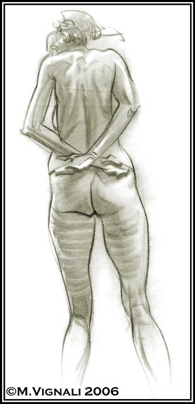
This image was drawn with a China Marker on tracing paper. Once I scanned it, I superimposed the image over a textured background to give it a more "artsy" look. The image was drawn in five minutes.
Another Figure Drawing

I've been figure drawing regularly since 1989. That's NOT including the four years of figure drawing in art school from 1983-1987. I think figure drawing is the cornerstone of good draftsmanship and design, and so I make an effort to attend figure drawing classes on a weekly basis. When I was in Utah, I also taught figure drawing, as well as participated in an open drawing lab.
Fortunately, Sony Pictures provides a drawing workshop with instructor Karl Gnass. Although I like his teaching, the poses are a little too short for me. Most of the time the model's poses range from three minutes, to five minutes. Which means it's very difficult to have any time to render shadows, volumes, and design shadow shapes. Rather than simply limit myself to doing line drawings with generalized volumes, I'm still trying to do what I normally do in a 20 minute sketch in only five or eight minutes.

On this particular image, the figure was drawn in eight minutes on tracing paper and China Marker.

Figure Drawing This Week


I've completed another page for our El-Pacifico blog. Our pirates are now attempting to steal a ship! I have it linked on my Blog Links section under EL-PACIFICO, or you can cut and paste this address: http://el-pacifico.blogspot.com

New Pacifico Page

Back in 1998, I did about a year's worth of development work on Walt Disney's Atlantis. Although the film had many story and concept problems, I have to admit it was a lot of fun to work on. The Art-Of book for this film had about ten of my visual development images printed, however this was not one of the images printed in the book.
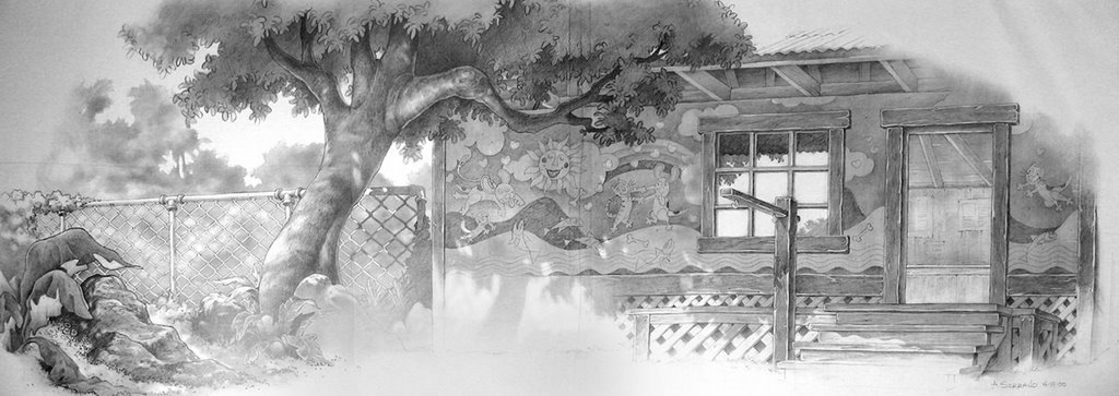
In this scene, Rourke has stolen something (I think it was the princess' crystal), and is attempting to make a getaway. The Atlantean charge Rourke, as he attempts to fend them off like Daniel Boone at the Alamo. Once in the cockpit, I imagined he would fire his gun and cut the rope and the plane would be launched into the air. This scene never made it to the film, however the film's actual getaway sequence takes place when Rourke and Helga try to escape using a hot air balloon.

Why did I imagine the getaway like this? Since the lost city was sitting inside a cavern, surrounded by water with only a few patches of land, I asked myself, "How they would launch a plane?" I put myself in their place and realized that it would be near impossible to launch a plane with no runway, so I imagined a large wooden contraption like a catapult that would launch the plane into the air, whereupon the engine would do the rest.

As you can see, the characters are heavily influenced by Mike Mignola, who was the style artist for the movie. Unfortunately, the Mignola style was barely recognizable by the end of the film...the final version had been "Disneyfied" to the point that it lost it's original inspiration.

This drawing is about 16x22 or so, and drawn on vellum with black Prismapencil.

Atlantis, The Lost Script


For those of you that don't know about Armand Serrano, he's a talent you might want to get acquainted with. He's certainly one of the best visual development artists I've had the privilage of working with in my 20 years in the business.

You can visit Armand Serrano's new art blog at: http://armandserrano.blogspot.com/ or simply click on the link I've provided in my links section.

Here's a little history. Both Armand and I worked together during our time at Disney, but never met. I worked at the California studio, and then as a freelancer when I lived and worked out of Utah, whereas Armand worked at the Florida studio. We are currenty working together here at Sony helping to develop Sony's second CG animated feature, and in the process have become good friends.

Armand's work is amazing and well worth a visit!

Introducing Armand Serrano

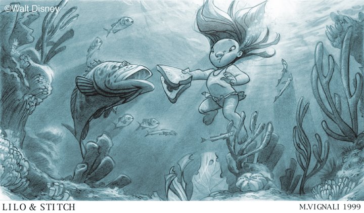
Again, this drawing was done in developement for Disney's Lilo & Stitch. In this scene, Lilo is feeding Pudge the fish her peanut butter and jelly sandwich. This image never made it to the final film, but the idea of the fish was kept during the title sequence as a down shot through the water. I like their verison better.
In my drawing, you can see that I'm playing around with some underwater lighting effects and refractions. This image was drawn in graphite.

As a note: the underwater fauna was completely incorrect in my drawing. I couldn't find underwater Hawaiian reference at the time, but when I was sent to Hawaii with the Disney research trip I had an opportunity to snorkel in the ocean ... and discovered that I had missed the mark. The corral is very different there, and not as colorful ... but the fish do eat from your hand. While we were feeding the fish, one of the parrot fish bit art director Ric Sluiter on the hand so hard he drew blood. So much for the saying, "Don't bite the hand that feeds you."

Pudge The Fish

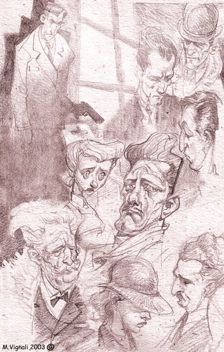
A couple years ago a friend asked me to sketch a few pages in his sketchbook. I wasn't sure what to draw, so I sat down in front of the TV and sketched these out. The film was some old black and white German film with a very young Ingrid Bergman in it. There were English subtitles, but I was busy sketching and wasn't paying attention to the story. However, there were some really great looking faces and lighting situations.
Sketchbook Sketches


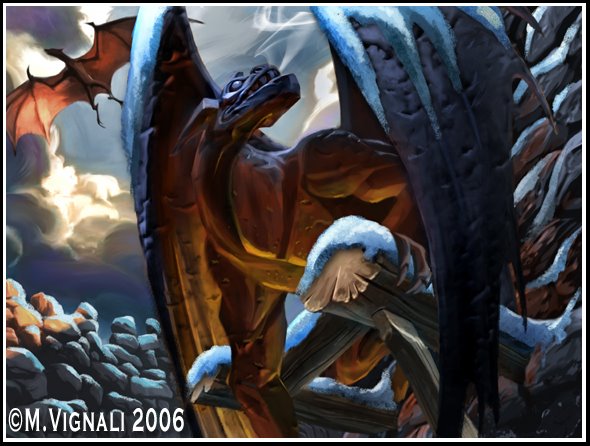
I painted this image for Wizards of the Coast. The assignment was to paint a castle gargoyle awakening after a snow storm has passed, and taking flight into the air. Also note, the gargoyle had to be made of stone and the castle had to be a primitive looking structure.

Awakening Gargoyle

I have posted a full comic page on http://el-pacifico.blogspot.com.
Just follow this link, or the link provided on the left hand side of this blog under "Blog Links."

A Full Page Has Been Posted!

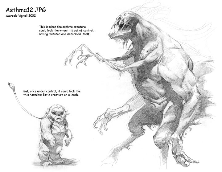
Years ago, while working as a freelancer, I did a some design work for a commerical spot. I was contacted by Rhythm and Hues, their client needed a monster that would represent a two fold problem, and two designs. The art director for this project was the very well accomplished Dan Quarnstrom.
First off, I had to design what the monster would look like when it was under control ... tied to a leash. Then, do a version when it was out of control. The monster had to represent both "constriction" and "scratching." This meant the monster would be two headed with four arms. One set of arms to grab and squeeze, and another set of arms to scratch and claw. How I put it together was up to me.

There were several versions I did, including some humorous ones that looked like muppets, but I thought this design was interesting enough to post. This drawing is good example of having all my anatomy and figure drawing experience come in handy.

This drawing was done with graphite on Bienfang Ledger paper.

Athsma Monster

©1999 Walt Disney
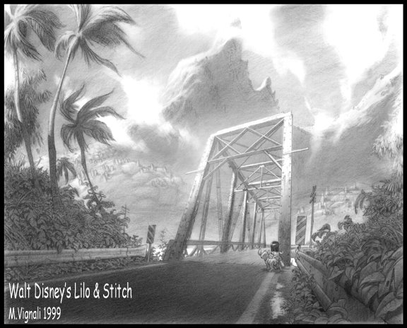
This image was drawn for Walt Disney’s Lilo & Stitch … and as you can see from this image Stitch is handled like a dog. If you read my last Lilo & Stitch blog entry you’ll understand why.

I like this image because it has a nice feeling, but also because it was part of my exploration of the island. In this drawing, Lilo uses a culvert to cross a highway and make it to the beach.

I thought this image never made it to the film, but it did. When talking to Armand Serrano, he showed me how he translated my image to make it work for one of the music numbers. Armand Serrano will be posting his version of this image soon. Also, this image did make it to one of the Disney books, but they printed the image really light and put text all over the top of it. So, here it for your viewing pleasure without obstruction. This is a prime example of my visual exploration and development of a subject.

This image was drawn with graphite on white Bienfang ledger paper. The paper has a plate finish (smooth) and takes the graphite really well. You can compare this drawing to the other Lilo & Stitch blog entry to see the difference between my use of graphite and paper, verses Prisma pencil and vellum. The other Lilo & Stitch image I’m referring to is called, “Barbershop.”

Usually, after I thumbnail my ideas out, I make a decision as to which medium would work best for that particular image.

The trick to drawing on this paper with graphite is using a soft lead pencil … but not too soft. My pencils range from HB (the hardest lead) to 4B (the softest lead). Any softer and it won’t stay on the paper without moving around and getting everything messy, and the harder lead pencils simply won’t show up on the paper.

Note all the framing and compositional techniques in this image. Can you spot them?

The Culvert


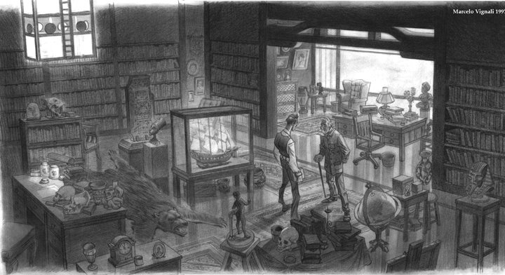
This is a conceptual design I did for Disney's Atlantis in 1997. Wow, nearly ten years ago!

When I was first approached with the Atlantis project I had it described to me as an animated Indiana Jones adventure, done in Mike Mignola's comic book style. I was also told that this particular film would be different than its predecessors in that it would not be a musical or comedy. All in all, I thought this was a fantastic idea!

It didn't take long to see that the graphic Mignola styling for the backgrounds was being abandoned (as is reflected in this drawing). Soon afterwards, the characters also lost the Mignola influence. One of the things I kept being asked of was to create a sense of atmosphere and drama. I tried to create a sense of mystery, drama, and of course atmosphere, but also to add a sense of dignity to the characters. In this particular case I drew Preston Whitmore as a dignified elderly gentleman who was passing the mysterious book to the young Milo.

In the end result, the Mignola comic book influence was all but gone, and the film turned into a comedy. Because much of the original creative vision was abandoned, I think the film was caught inbetween that nowhere land of neither comedy, nor drama.

This drawing was also drawn in Prismacolor on vellum and it is about 15"x24". Start to finish, the drawing took about a week. This is a good example of the type of work I did for Disney while working for them, combining characters, backgrounds and my own conceptualization of themes and ideas. Ultimately, as a freelancer, my job on this project was to create inspiration and innovation, not direction.

Note: There is a caricature of myself as a small Inca clay pot atop Whitmore's desk.

Conceptual Drawing for Atlantis

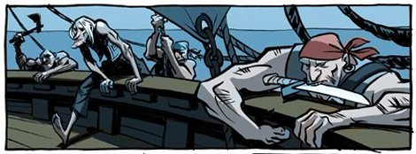
You've heard of Sketchclub, now we're trying a new blog altogether ... a pirate blog! Go to,
http://el-pacifico.blogspot.com/

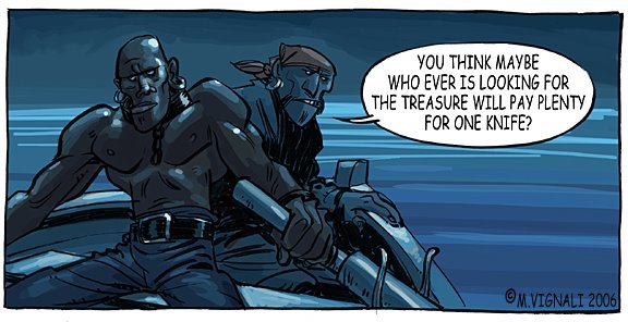
Marcos Mateu, Armand Serrano and myself are going to play around with the idea of inventing a story as we go along. We're going to try and handle this exercise like a serial comic in a newspaper and see where it leads us. So far, all we've done is post some inspirational/vis-dev sketches. Please come by and have a look.

El Pacifico

Here's another image that was drawn for Lilo & Stitch...and perhaps my favorite and most sentimental image.
When I got the idea of having Lilo explore her community, I thought she could stop by a local barbershop. But, this being a small island --and and even smaller community -- I thought I would also make the local barber the local PO Box as well.

During this time I was freelancing for Disney, while living in the small town of St. George, Utah. I used to get my hair cut at Anderson's Chop Shop, and I thought this would be the perfect place to shoot reference. I really liked the homemade barber's cabinet and old fashioned barber's chairs, so I thought it would be ideal. The chair, clock, water cooler and cabinet, are drawn just as it really was at my barbers. The rest of the building was drawn to reflect the Hawaiian architecture.

The time drawn on the clock is the actual time I completed the drawing.

I wanted to show my barber John Anderson the drawing, but I wanted to wait until the film was released before I showed him the drawing. That way, it could never be said by anyone that I had compromised corporate security. Sadly, John Anderson would never see the drawing. A few months before the film was released, John was murdered in his barbershop. It was the first aggravated murder in St. George in ten years.

When I told Dean de Blois and Chris Sanders that I wanted to give his widow a print of my image, both Chris and Dean paid for a professional print out of their own pockets and had it sent to me. I am very grateful to both Chris and Dean for their compassion. Those guys are tops in my book.

The drawing was drawn on vellum and Prismacolor pencil. The original is about 16x20, and it was drawn in about a week.

Barbershop

In 1999, I was asked to be part of the Lilo & Stitch crew. Along with Mulan, this is one of the films I am most proud of during my tenure working for the mouse.

During it's inception, this show was pretty secretive ... so much so that they didn't tell me Stitch was an alien for several months! I think they were so busy keeping their cards close to their vest, they simply forgot that I didn't know Stitch was from another planet. So, a lot of my visual development sketches had Stitch on all fours.

It was a pleasure working with Dean de Blois and Chris Sanders. They gave me the fun assignment of taking my imagination and poke around the island coming up with fun imagery.

In this image, I tried to capture the Hawaiian atmosphere in the air. I drew this image using a black Prismacolor pencil on vellum.

Lilo Pencil Drawings