Flickr Images

https://www.facebook.com/vignalistudio/ https://www.youtube.com/channel/UCL7SU_6-cxyuVEIHcV1nsiA

A Full Page Has Been Posted!

9 comments
I have posted a full comic page on http://el-pacifico.blogspot.com.
Just follow this link, or the link provided on the left hand side of this blog under "Blog Links."

9 comments :

Athsma Monster

13 comments
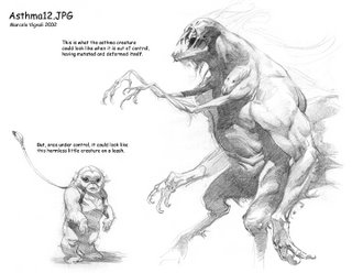
Years ago, while working as a freelancer, I did a some design work for a commerical spot. I was contacted by Rhythm and Hues, their client needed a monster that would represent a two fold problem, and two designs. The art director for this project was the very well accomplished Dan Quarnstrom.

First off, I had to design what the monster would look like when it was under control ... tied to a leash. Then, do a version when it was out of control. The monster had to represent both "constriction" and "scratching." This meant the monster would be two headed with four arms. One set of arms to grab and squeeze, and another set of arms to scratch and claw. How I put it together was up to me.

There were several versions I did, including some humorous ones that looked like muppets, but I thought this design was interesting enough to post. This drawing is good example of having all my anatomy and figure drawing experience come in handy.

This drawing was done with graphite on Bienfang Ledger paper.

13 comments :

The Culvert

8 comments
©1999 Walt Disney
This image was drawn for Walt Disney’s Lilo & Stitch … and as you can see from this image Stitch is handled like a dog. If you read my last Lilo & Stitch blog entry you’ll understand why.

I like this image because it has a nice feeling, but also because it was part of my exploration of the island. In this drawing, Lilo uses a culvert to cross a highway and make it to the beach.

I thought this image never made it to the film, but it did. When talking to Armand Serrano, he showed me how he translated my image to make it work for one of the music numbers. Armand Serrano will be posting his version of this image soon. Also, this image did make it to one of the Disney books, but they printed the image really light and put text all over the top of it. So, here it for your viewing pleasure without obstruction. This is a prime example of my visual exploration and development of a subject.

This image was drawn with graphite on white Bienfang ledger paper. The paper has a plate finish (smooth) and takes the graphite really well. You can compare this drawing to the other Lilo & Stitch blog entry to see the difference between my use of graphite and paper, verses Prisma pencil and vellum. The other Lilo & Stitch image I’m referring to is called, “Barbershop.”

Usually, after I thumbnail my ideas out, I make a decision as to which medium would work best for that particular image.

The trick to drawing on this paper with graphite is using a soft lead pencil … but not too soft. My pencils range from HB (the hardest lead) to 4B (the softest lead). Any softer and it won’t stay on the paper without moving around and getting everything messy, and the harder lead pencils simply won’t show up on the paper.

Note all the framing and compositional techniques in this image. Can you spot them?

8 comments :

Conceptual Drawing for Atlantis

16 comments

This is a conceptual design I did for Disney's Atlantis in 1997. Wow, nearly ten years ago!

When I was first approached with the Atlantis project I had it described to me as an animated Indiana Jones adventure, done in Mike Mignola's comic book style. I was also told that this particular film would be different than its predecessors in that it would not be a musical or comedy. All in all, I thought this was a fantastic idea!

It didn't take long to see that the graphic Mignola styling for the backgrounds was being abandoned (as is reflected in this drawing). Soon afterwards, the characters also lost the Mignola influence. One of the things I kept being asked of was to create a sense of atmosphere and drama. I tried to create a sense of mystery, drama, and of course atmosphere, but also to add a sense of dignity to the characters. In this particular case I drew Preston Whitmore as a dignified elderly gentleman who was passing the mysterious book to the young Milo.

In the end result, the Mignola comic book influence was all but gone, and the film turned into a comedy. Because much of the original creative vision was abandoned, I think the film was caught inbetween that nowhere land of neither comedy, nor drama.

This drawing was also drawn in Prismacolor on vellum and it is about 15"x24". Start to finish, the drawing took about a week. This is a good example of the type of work I did for Disney while working for them, combining characters, backgrounds and my own conceptualization of themes and ideas. Ultimately, as a freelancer, my job on this project was to create inspiration and innovation, not direction.

Note: There is a caricature of myself as a small Inca clay pot atop Whitmore's desk.

16 comments :

El Pacifico

7 comments
You've heard of Sketchclub, now we're trying a new blog altogether ... a pirate blog! Go to,
http://el-pacifico.blogspot.com/

Marcos Mateu, Armand Serrano and myself are going to play around with the idea of inventing a story as we go along. We're going to try and handle this exercise like a serial comic in a newspaper and see where it leads us. So far, all we've done is post some inspirational/vis-dev sketches. Please come by and have a look.

7 comments :

Barbershop

16 comments
Here's another image that was drawn for Lilo & Stitch...and perhaps my favorite and most sentimental image.

When I got the idea of having Lilo explore her community, I thought she could stop by a local barbershop. But, this being a small island --and and even smaller community -- I thought I would also make the local barber the local PO Box as well.

During this time I was freelancing for Disney, while living in the small town of St. George, Utah. I used to get my hair cut at Anderson's Chop Shop, and I thought this would be the perfect place to shoot reference. I really liked the homemade barber's cabinet and old fashioned barber's chairs, so I thought it would be ideal. The chair, clock, water cooler and cabinet, are drawn just as it really was at my barbers. The rest of the building was drawn to reflect the Hawaiian architecture.

The time drawn on the clock is the actual time I completed the drawing.

I wanted to show my barber John Anderson the drawing, but I wanted to wait until the film was released before I showed him the drawing. That way, it could never be said by anyone that I had compromised corporate security. Sadly, John Anderson would never see the drawing. A few months before the film was released, John was murdered in his barbershop. It was the first aggravated murder in St. George in ten years.

When I told Dean de Blois and Chris Sanders that I wanted to give his widow a print of my image, both Chris and Dean paid for a professional print out of their own pockets and had it sent to me. I am very grateful to both Chris and Dean for their compassion. Those guys are tops in my book.

The drawing was drawn on vellum and Prismacolor pencil. The original is about 16x20, and it was drawn in about a week.

16 comments :

Lilo Pencil Drawings

16 comments
In 1999, I was asked to be part of the Lilo & Stitch crew. Along with Mulan, this is one of the films I am most proud of during my tenure working for the mouse.

During it's inception, this show was pretty secretive ... so much so that they didn't tell me Stitch was an alien for several months! I think they were so busy keeping their cards close to their vest, they simply forgot that I didn't know Stitch was from another planet. So, a lot of my visual development sketches had Stitch on all fours.

It was a pleasure working with Dean de Blois and Chris Sanders. They gave me the fun assignment of taking my imagination and poke around the island coming up with fun imagery.

In this image, I tried to capture the Hawaiian atmosphere in the air. I drew this image using a black Prismacolor pencil on vellum.

16 comments :