Flickr Images

https://www.facebook.com/vignalistudio/ https://www.youtube.com/channel/UCL7SU_6-cxyuVEIHcV1nsiA
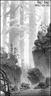
Sky Scraper Trees

18 comments
Here's one I did for Brother Bear. I was asked to draw the abandoned human's village.

The initial intent of the directors was to make the landscape look more prehistoric, so I added these giant Redwood trees to make the land look more interesting, I also thought it would give the human world a more diminuative role within nature; I wanted these trees to look like skycrapers.

Sadly, they didn't use the idea and instead went for a more straight foward/natural landscape. My job as a visual development artist is to come up with visually compelling, unique and thought provoking images, and I think this one does just that.

18 comments :

Figure Drawing Class?

15 comments
Today we had our usual figure drawing class, but the model wasn't very inspiring.
So, I hid in a corner and in a clandestine manner sketched out my collegues!

These are kind of what my sketches look like when I go Sketchclubbing on Fridays.

15 comments :

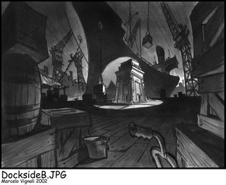
Tutenstein Rough Marker Sketch

10 comments
In this scene, the Tut shrine was delivered at the dock.

I did a series of roughs like this, but the client wanted me to pull back a bit on the visual caricature of the backgrounds.

Again, this one was done "old school" with ink and magic marker.

10 comments :

More TUTENSTEIN

8 comments
By popular request, here's another one. This drawing actually hooks up with the previous one. If you are standing in the living room, and walk past the TV through the door on left, you would enter this kitchen on the right side. I had done a floor plan to make the whole thing work out.

This image is a daytime drawing, as opposed to the last one. I used the daylight pouring in through the kitchen sink window to create a graphic pattern on the walls and counter.

8 comments :

Tutenstein

11 comments
Back in 2002, while I was working as a freelance artist, I did a little work on Tutenstein.

The style of show was simpler than that of Disney, and the turnaround time for these designs was also a lot quicker...as is the case with TV. So, I made the necessary adjustments. The name of the game for a freelance artist is versatility and practicality, and I tried to remain as flexible and malleable as possible to what ever the directors needed.

I kept the backgrounds playful to match the character design style set by veteran character designer Fil Barlow. I drew out the line work, and then simply added simple value tones in Photoshop. There was very little rendering on these backgrounds, rather there was a lot more mask cutting and bucket-fill. Stylistically, it had to have a certain believability and normalcy, so that the fantasy aspects would stand out in contrast...hence the backgrounds are pretty straightforward.

If you are interested in seeing more of these backgrounds for Tutenstein, let me know and I'll see if I can dig up a few more.

I happen to be a huge fan of the Creature Of The Black Lagoon, so I put that on the TV.

11 comments :

Whew, I've posted at Sketchclub ...

11 comments
It has been a while since I've posted on Sketchclub, but here it is!

Mark McDonnell from Sketchclub East came to visit our group, and we went out sketch clubbing at lunch. To see how our memory drawings compare, go to http://sketchclub.blogspot.com to see Mark's and Armand's memory sketch.

11 comments :

Another Full Page At EL PACIFICO

7 comments
The saga continues! I've posted another full page of Pirate action at:

http://EL-PACIFICO.blogspot.com

Just cut and paste this link, or click on the EL PACIFICO link provided in the "Blog Links" section.

7 comments :